
How Confusing Websites Create Invisible Revenue Leaks
Chapter 6 - The Cost of Cognitive Friction in SaaS and Fintech
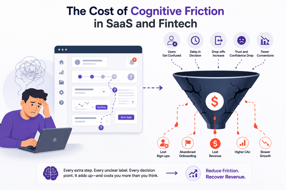
Complex products amplify clarity problems. This is why SaaS and fintech companies experience disproportionate risk from confusing UX.
Product Complexity Increases Interpretation Burden
B2B software products often involve multi-step onboarding, technical workflows, cross-functional stakeholders, compliance concerns, and integration dependencies. Every additional layer increases the cognitive load users must manage, and without strong clarity systems, friction compounds rapidly.
For example, a PLG SaaS platform may offer powerful automation capabilities but fail to guide users toward a meaningful first success milestone. As a result, users sign up, explore the interface briefly, and then stall before reaching meaningful activation.
This happens not because the product lacks value, but because the onboarding sequence failed to reduce uncertainty progressively.
Fintech Experiences Depend Heavily on Trust
Baymard Institute usability research consistently shows that users interpret friction during sensitive processes, especially payments, onboarding, and verification, as potential risk indicators.
In fintech environments, interface confusion does not feel cosmetic; it feels unsafe. Fintech products operate inside high-sensitivity decision environments where users evaluate not only utility, but also perceived safety.
As a result, confusing onboarding flows, inconsistent terminology, or vague compliance explanations create immediate hesitation, and hesitation in financial environments usually translates directly into abandonment.
Enterprise Buying Journeys Amplify Friction
Enterprise buyers rarely evaluate products alone.
Internal stakeholders must understand positioning, communicate value internally, defend purchasing decisions, and assess operational risk
If the website creates ambiguity, internal advocacy becomes harder. This extends sales cycles and weakens deal momentum.
Fear of Inaction: Many companies continue scaling acquisition spend while their website quietly reduces buyer confidence at every stage of the funnel. That creates a dangerous illusion of growth activity without growth efficiency.
Before vs After UX Clarity Scenario
Clarity compounds, and so does confusion. Consider this illustrative B2B SaaS scenario.
Before UX Clarity Optimization
The homepage contains four competing CTAs, dense feature-heavy copy, abstract positioning, navigation focused on internal product categories, and weak onboarding guidance.
As a result, users scroll heavily without engaging, demo bookings stagnate, paid CAC rises, onboarding completion weakens, and sales teams report low-intent leads.
After UX Clarity Optimization
The experience is simplified around one primary conversion action, clear value hierarchy, industry-specific messaging, strong onboarding progression, and reduced decision complexity.
Highest-Impact Clarity Fixes First
Fix comprehension before redesigning aesthetics.
High-performing teams usually improve conversion efficiency faster by reducing interpretation effort before investing in large-scale visual redesigns.
Before redesigning entire experiences, high-performing teams usually address:
Homepage positioning clarity
CTA hierarchy simplification
Onboarding sequencing
Navigation relevance
Trust signal visibility
These changes often improve conversion efficiency faster than large-scale redesign projects because they reduce interpretation effort immediately.
The Strategic Insight
Many teams pursue growth through acquisition scaling, but the more efficient path is often conversion clarity because improving comprehension increases the efficiency of traffic you already paid to acquire.
As a result, this approach is usually faster, cheaper, and operationally healthier than continuously increasing spend.