
How Confusing Websites Create Invisible Revenue Leaks
Chapter 2 - What Invisible Revenue Leaks Actually Mean
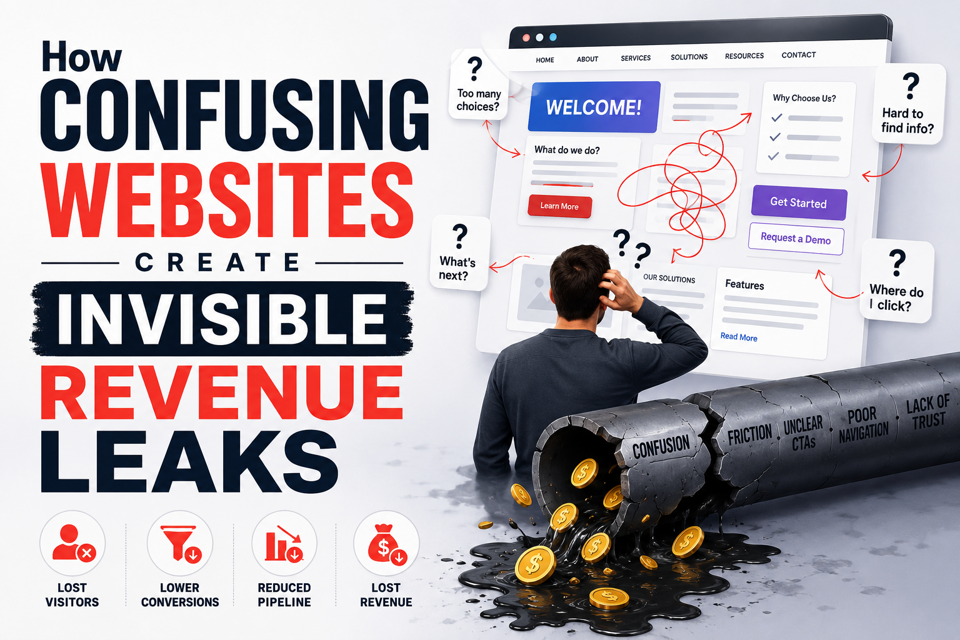
Most teams measure visible losses such as traffic drops, form failures, and ad underperformance. However, invisible revenue leaks operate differently because they occur when users reach your website but fail to move forward due to unnecessary decision friction within the experience.
The problem is not always visual design quality, as even a modern-looking interface can create uncertainty if visitors cannot quickly understand what the product does, why it matters, whether it fits their use case, or what action they should take next.
This distinction matters because confusion compounds across the funnel. For example, an AI startup homepage with four competing CTAs may appear flexible internally, but to a first-time visitor, it creates hesitation. Instead of increasing engagement opportunities, it increases cognitive load.
The result is subtle but costly: users bounce before understanding differentiation, demo intent weakens, sales conversations become less qualified, and paid acquisition efficiency declines.
Confusion rarely looks catastrophic at first.
It often appears as slightly weaker performance.
A 1% drop in conversion here, a few seconds of hesitation there, and lower onboarding completion somewhere else. However, when compounded across acquisition spend and sales cycles, those small inefficiencies become significant revenue decay.
This is why high-growth B2B companies increasingly treat UX clarity as revenue infrastructure rather than aesthetic polish.
The Hidden Cost of “Almost Clear” Messaging
One B2B AI company reduced homepage CTA options from four actions to one primary conversion path after session recordings revealed users repeatedly hovering between “Book Demo” and “Explore Platform” without clicking either.
Within six weeks, qualified demo intent improved noticeably because decision energy was no longer split across competing actions.
The visual redesign itself was minimal, but the comprehension improvement was not. The issue was not traffic; it was interpretation overload.
Many companies believe users will “figure it out,” but enterprise buyers usually do not. Especially in SaaS and fintech, users evaluate products under time pressure and risk sensitivity, so if positioning requires excessive interpretation, confidence drops immediately.
For example, an export-focused B2B platform may present multiple technical capabilities without clarifying the core operational benefit, causing international buyers to struggle with understanding whether the platform improves compliance, logistics, financing, or procurement. The result is not always an instant bounce. Sometimes visitors stay, scroll, compare tabs, revisit pricing, and then disappear.
That behavior is not engagement, it is unresolved uncertainty.
If your traffic numbers look healthy but conversion intent feels weak, a structured UX audit with Hyperiux often reveals friction patterns analytics alone cannot explain.